
What is E-commerce Navigation? How it Helps to Get Potential Customers?
These days, online shopping has become second nature to everyone, from busy city dwellers to folks in quiet towns. Whether you’re scrolling through your phone on the subway or browsing on a laptop at home, ecommerce websites are at your fingertips. The convenience factor is undeniable, but ecommerce goes beyond that.
For instance, think of a library that has no signs or directions; surely finding a book becomes a task, right? The same thing with e-commerce navigation, without this customers face difficulty in finding things in an online store.
It is the map that guides users to browse through categories, and filters to find products instantly. If a tech-savvy teenager or a senior explores online stores, it should make the user’s shopping experience seamless. Having good navigation can convert visitors into happy customers, making the path from browsing to buying effortless.
The booming world of e-commerce shows no signs of slowing down. Retail e-commerce sales are projected to exceed 6.3 trillion U.S. dollars worldwide in 2024 and expected to climb even higher in the coming years. Therefore, businesses should revamp their online presence and pay close attention to how their websites are navigated.
As a leading Ecommerce App Development Services, we understand the importance of user experience in today’s competitive online marketplace. Let’s break down e-commerce navigation which includes all the elements such as menus, search bars, filters, and product categories. It’s important to improve these aspects in order to keep customers engaged and to make them return with the help of ecommerce loyalty rewards program.
When it comes to ecommerce navigation. You must care because how easily users can click through your site directly impacts their entire shopping experience. A well-designed site with minimal UX issues encourages users to effortlessly browse your products and ultimately hit that buy button.
According to a study published on Statistica in NOV 2023, Nearly 40% of online shoppers leave websites due to confusing ecommerce navigation which leads to a higher bounce rate. Your website’s navigation as a friendly salesperson guides visitors to your products and makes their shopping experience easy.
Keep reading to get valuable insights as we will provide real-life examples with tips to improve your site’s ecommerce navigation.
Join us to make your ecommerce site stand out and surpass customer expectations.
The Importance of Navigation in E-Commerce
According to a study published on Statistica, Nearly 40% of online shoppers leave websites due to confusing ecommerce navigation which leads to a higher bounce rate. So it is essential to have an effective e-commerce navigation in your platform or website.
Because it serves as a pillar for any successful e-commerce platform, it reflects in user experience and sales performance.
Providing such clear and logical navigation to the products essentially cuts down on customers’ frustration and gets them to browse more items, hence increasing the sale potential.
When customers can easily find what they need, they are more likely to buy from the site again and recommend it to others. Above all, this trust, satisfaction, and long-term devotion inevitably boosts conversion rates and platform growth.
In addition, a clear arrangement of the key elements should make them stay long along with the help of an ecommerce loyalty rewards program. So, here are some best ecommerce trends you should consider to keep your platform related to today.
E-Commerce Trends to Consider
E-commerce is emerging through certain crucial trends that determine navigation strategies. In the third quarter of 2024, 68% of online shopping orders are from mobile devices, which signifies that a brand requires mobile navigation optimization.
Personalization is having a huge impact on attracting customers because 91% of consumers would rather shop with a brand that offers products that are similar to their interests and experiences, thus necessitating dynamic navigation menus.
Growth in Buy Now, Pay Later (BNPL) services also calls for an increased need for direct access to these kinds of payment solutions. To get more ideas refer to the Buy Now Pay Later Ecommerce Platform from Appkodes.
Another emerging trend is sustainability; 67% of consumers would rather buy from brands whose focus is on eco-friendliness, which should then be reflected in the navigation menus.
Ultimately, the voice commerce market grew from $ 90.54 in 2023 to $ 116.83 billion in 2024 at a compound annual growth rate(CAGR) thus necessitating the development of navigation suited for voice input.
These trends then continue to transform the consumer experience in shopping and interacting with online stores, thus requiring adaptations in the configuration of e-commerce platform navigation.
Keep reading to get valuable insights as we will provide real-life examples with tips to improve your site’s ecommerce navigation.
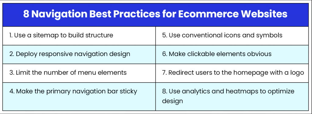
Ecommerce Navigation Best Practices
All those years, ecommerce stores experimented with a range of different navigation structures- some worked and some didn’t. But what really makes navigation intuitive is ecommerce navigation best practices.
Let’s have a look at them:
Smashing magazine conducted a study that uncovered the elements that turn a confusing maze into a delightful shopping experience. Let’s walk through how to build a high-converting ecommerce site that keeps bringing back customers on both mobile and desktop users.
Construct a User-friendly Navigational Structure
Step one is to select the proper ecommerce navigation type. This is the kind of framework in which it will be structured. Let’s have a closer look at three widely used formats:
Mega Menu
Think of the layout of a department store but everything is compressed into one menu. Mega menus present a full view of all product categories and their subcategories, usually individually, perhaps in a grid.
Especially useful for those merchants with a very wide range of products, using, for example, a sporting goods store where you may have ‘categories’ that are sub-categorized further into specific sports.
Horizontal Menu
Horizontal Menu For this type, try to imagine a hip bar running atop your web page with your major product categories all in a row. It’s great for stores that don’t have a huge list of products. Say a store has the product categories “Dresses,” “Tops,” “Bottoms,” and “Accessories.”
Vertical Menu
A vertical menu, created as a vertical column on the left side of a web page, is a space-saving ecommerce navigation tool for your sites with a moderate range of products. It organizes categories and subcategories hierarchically which makes it easier for users to navigate.
Vertical menus are ideal for mobile due to their small screen compatibility and allow ecommerce navigation using keyboard arrows and users the Tab key. However, they can become cluttered with too many categories and lack the upfront exposure of options that mega menus offer, potentially limiting the discovery of new products..
Accordion menu
The feature lets one expand its subcategories in case the main category is clicked on. The solution is very space-efficient and works great for a store with an average range of products and well-definable hierarchies. For example, a store that sells electronics would have main categories like Laptops, Tablets, and Smartphones. After clicking any of these, it would then show the subcategories: by brand, by operating system, by screen size.
One size doesn’t fit all. Look at your product lines, target market, and site design. Mega menus would be excessive for a small store, but a horizontal menu could not support a wide range of products. Look at the layout of your website and select the format that will fit within the overall site design.
Now let us see how the industry leader approaches this. Amazon, one of the best online stores, uses mega-menus to help visitors easily navigate categories like “Electronics,” “Clothing,” “Home & Kitchen,” and “Beauty,” which break down into detailed subcategories.
Categories and subcategories
You should logically arrange products in your online shop the same way you would in your closet: shirts together, pants together. This simple organization groups related items under clear categories which makes it easy for customers to find what they need, reduce frustration, and boost sales.
Mega menus are ideal for large stores with extensive product ranges, as they offer a comprehensive view of all categories and subcategories in a grid format. For stores with more manageable product ranges, a simpler horizontal or accordion menu is better.
For example, a shoe store could have main categories listed like “Men’s Shoes,” “Women’s Shoes,” and “Kids’ Shoes,” each can be presented with more than 10 subcategory options such as “Sneakers,” “Boots,” and “Sandals.” This hierarchy makes it easy for users to navigate from the homepage to their desired product. Clear ecommerce navigation, such as vertical or dropdown menu with these 10 subcategory options which enhances user experience and leads to higher satisfaction and conversion rates.
Faceted Navigation to Refine Search with Finesse
Take this concept a step in the right user-friendly direction ie, faceted ecommerce navigation. This simply means customers are allowed to filter and fine-tune their search by certain criteria like brand, price, color, size, and material.
An example of using faceted ecommerce navigation is when navigating a large online furniture store—which allows sorting by a parent category pages such as sofas, chairs, or tables, and then further filtering by price range, material (leather, fabric), and color (black, beige, brown). This provides an immediate path into the desired items, ensuring the consumer’s quest is time-efficient and satisfactory.
Benefits of Faceted Navigation
Consider a customer who comes into your physical store knowing exactly what product they want. On an Internet platform, faceted navigation saves the consumer time that would be spent on products that do not interest him.
It leads to increasing the chances of digging into that hidden gem from your product offering, with potential higher order values. Ecommerce brands can allow the user to refine their search in a better-curated manner so they walk away with exactly what they want, the fastest, and in the best possible way to personalize the experience.
Optimizing Drop-down Menus:
The Final Touches After you have created a sound navigational structure, next, try to make the most out of your menu in terms of usability. A few points to think about:
Descriptive and Succinct Naming
Your category names should be comparable to highway billboards in guiding the customer to their destination. Try coming up with clear, descriptive, and readily understandable labels. Do not use jargon or very technical terminologies. For instance, not “Athletic Footwear,” but rather “Running Shoes” or “Basketball Sneakers.” This way, it is clear what sort of things people are most likely to find in a given category and they are not confused; therefore, frustration is kept to a minimum.
In real-life terms, returning to the clothing store example: it would have descriptive and clear labels rather than category names such as “Womens_Dresses_01” or “Tops_Summer19.” Simple labels such as “Dress,” “Summer Dress,” “Formal Dress,” “T-Shirts,” “Tank Tops,” and “Blouses” would make it quite easy to navigate and remove the guesswork your customer might have to employ.
Visual Hierarchy
Human beings respond innately to visual stimuli. Leverage this fact and apply visual hierarchy to lead the customer’s journey. Here’s how:
- Font Size and Weight
The main categories shall be in large stature and with a bold font that catches the eye and establishes their importance. The subcategories would, to maintain clarity in the hierarchy, be in a slightly smaller font size. - Color Contrast
Use colors for the menu background and text that will contrast with each other well to provide the best contrast. Keep in mind what colors to use with respect to the target audience and brand aesthetic. - Whitespace
Use whitespace strategically so the menus have visual breathing space—it will look less cluttered and be easier to navigate.
Mobile Optimization
An experience of smooth ecommerce navigation that will be liquid on any device nowadays. The statistics already speak for themselves: According to a study cited on Statistica, at least 70% of online shopping now happens on mobile phones.
Here is how you can make your site’s navigation optimized for mobile users,
Responsive
Your website’s navigation has to become responsive, which means it should adapt to each screen size. Use a menu that collapses into a hamburger icon on smaller screens. When that icon is clicked, the menu lists the categories in a nice clean user experience.
Make the biggest of touch targetable menu buttons—big enough on screens large enough for users to tap without stress. One of the biggest causes of frustration is patrons having issues fussing over menus with tiny items.
Prioritize key categories
Since space is a real constraint on a mobile screen, it is always better to showcase only a few top-sequence search categories in the main menu. Others that are less popular can be brought under another category named “More.”.
Observing these best practices will enable you to come up with user-friendly navigation menus with flair in terms of visual appeal. Remember, a good ecommerce navigation system works the same way a silent salesperson does, directing customers about your shopping area with the ability to, in the end, also increase your sales by integrating frictionless checkout.
Source: https://successive.tech/
CEO’s Nuggets of Wisdom
Don’t Get Lost in the Navigation Maze! Listed below are the most common ecommerce navigation mistakes to avoid.
- Complicated Navigation Structures
Avoid more complicated navigational structures, which can confuse customers with the use of more and more sub-categories, and not clear paths leading directly to the desired page. Keep it simple and intuitive.- Inconsistent or Unclear Labeling
Have consistent and clear names for your categories. Misleading or vague labels are frustrating for the user.- Not Optimized for Mobile
Deploy a mobile responsive website to view easily on mobile devices.- Poor Search Bar
It causes a lot of frustration, irritates users, and disappoints them by hindering their ability to find accurate search results. To make poor search bars better, apply ecommerce personalization suggestions, filters, and develop error toleration.- Ignoring User Testing and Data
User input and data—do not ignore user testing or data analysis. Test your navigation regularly and, through data, make further improvements to meet the user’s needs.
The Power of User Testing Your Navigation for Success
Remember the best navigation system is the one that works with your specific audience and product range. User testing is a good way to identify if there are any pain points that can be alleviated. Ecommerce navigation examples are there to guide you for inspiration.
Here’s how you do it:
Engage a diverse set of users
Target a group that includes as much diversity in demographics and shopping habits as is possible.
Check how they are navigating
Observe the way target users move within the website and their navigation choices to inform your testing approach and the elements to be considered.
Gather feedback
After the testing session, inquire of the user their experience on the navigation system. Ask whether it was easy to find products or ask if they can give you some suggestions on making improvements. Use feedback from users to develop a user-friendly navigation system that will be a driver towards the success of sales.
Advanced Navigation Strategies
Optimized search bars can help you find a product in an intuitive and fast way. Amazon’s search bar is a great example. Other features like auto-suggest and auto-correct that add great value for users. For instance, if a user writes “e-commerce navigation examples,” the top search bar should give instant suggestions relating to that keyword or product.
If you want to make your e-commerce site that resembles Amazon? Having a well-optimized search bar is essential and then making sure search algorithms are great and robust enough to handle typos and variations that would still lead to the right results; so the user finds what they are looking for without a hitch.
For instance, have a search bar such that with the right algorithms, it can accommodate all kinds of misspellings or irregularities, thereby allowing users access. One could also install numerous filters and enable different sorting options within the search results so that users further narrow down choices easily by finding exactly what they want.
Breadcrumb Navigation
It helps people make their way back to previous categories or pages. In real-time Zara’s website breadcrumb navigation allows users to navigate effortlessly. For example, Home > Women > Dresses > Casual Dresses > Summer Dresses.
This enables a user to go back and forth, exploring various related top-level categories, without starting from the beginning on the e-commerce home page.
Having a breadcrumb trail similar to Zara’s makes users want to explore all the categories with just a click without getting frustrated.
If users want to look at a specific dress but want to see other casual dresses or styles too, then they can simply click the “Casual Dresses” link in the breadcrumb trail which can let them explore more options.
Internal Linking
There is strategic linking to relevant products or pages that improves navigation within your site. Internal links would offer a great deal of help in the case of a path created for the customer to reach some complementary product to enhance the shopping experience, and it could bring a chance for one more sale.
For example, in a product description page for running shoes, you can lead related products through links like socks or other fitness products for the lower body, basically clothing, or fitness accessories in general. Not just does it make the website SEO-friendly, but it also keeps users engaged with a seamless browsing experience.
Leverage Customer Reviews and Ratings
Customer feedback, ecommerce ratings and reviews still bound the way of gaining trust and driving conversions. The buying decisions entered by the customers are spirited mostly by reviewing social proof.
Thus, a highly visible display of user ratings like the star rating and recent reviews that Best Buy makes available on its mobile product pages prevents the process of making purchases more nebulous.
Such transparency also reckons privacy-related trust by allowing customers direct access to real-time feedback.
Adding video reviews, verified buyer labels and influencer reviews would only further enhance the credibility and relevance of the outcome for conversion.
Ecommerce Navigation Examples
Highlighting examples of ecommerce stores with excellent navigation:
Amazon
Amazon is a gift for e-commerce navigation. New trends have shown that faceted navigation where customers can filter their finds according to several attributes like size, color, and price is very vital for the shopping experience.
Moreover, the optimized search bar works with complex algorithms to predict search queries and instantly fetch relevant products. The internal linking strategies of Amazon like recommendations, related products, and “customers who bought this also bought” suggestions encourage customers to view these additional items.
These add-up, easy-to-navigate interfaces provided to users help them easily filter those finds quickly without much friction and optimize conversion rates.
Zappos
Zappos indeed offers very good experiences to users through very well-defined category hierarchies, easy-to-use filters, very well-detailed breadcrumbs, and the most important one: customer reviews.
This all helps to facilitate the navigation and finding of products for the customers, thus reducing the uncertainty that arises during the purchase decision and boosting confidence.
Clearly defined paths and genuine reviews from customers improve the experience, ultimately leading to high conversion rates, with the best customer support for ecommerce as well.
IKEA
Ikea stands out with a parent-child-category structure online that keeps it easy and organized. The faceted navigation allows them to improve experience levels, and now users can easily filter results in terms of size, color, and price with that structured approach, thereby taking the shopping experience to a different dimension.
Many stores, including IKEA, also back up their navigation techniques with testimonials and data; they show very nicely how effective navigation can boost conversion and satisfaction on the side of users by real-world evidence. This blends the best structure with data use as a model for those sites wanting to optimize their navigation position.
How to Make Your E-commerce Platform Unique?
Accessibility features, such as WCAG compliance, help make websites usable for people with disabilities.
Include ARIA labels that work with screen readers and work with the keyboard for dynamic navigation.
Dynamic navigation based on geolocation allows sites to personalize content or promotions according to the user’s current location, which makes the whole shopping experience much more relevant.
subscription-based navigation, allowing quick access to exclusive benefits and products for subscribers, like those who have paid for Amazon Prime membership. Usability has been improved here and with tailored shopping experiences, engagement is also on a higher level.
A/B Testing and Optimization for Ecommerce Navigation
Why A/B Test Different Navigation Layouts? A/B testing simply means comparing web page versions to establish which of the two declares a higher degree of user engagement and therefore higher conversion rates.
Through diverse navigation layout testing, you can discover the best navigation for ecommerce that will satisfy your store’s needs and those of customers. This helps one pinpoint exactly what works better for your audience: be it the exact arrangement of the categories, the hamburger icon, or maybe even the fixed menus.
Tools and Techniques for A/B Testing Your Navigation
A/B Testing Tools
First, create different versions of your navigation design using the A/B testing tools like Google Analytics, Optimizely, and VWO.
This tool will allow you to see how it performs in real-time with users and also show which specific layout or design is best for improving user interface and maximizing performance.
Key A/B Testing Strategies
Structure Testing: Test navigational structures whether they make users’ finding process easy on different types of navigation sites, this includes broad categories and more detailed subcategories.
Search Bar Testing: Experiment with the search bar’s position and design to see differences in user behavior and search for products.
Breadcrumb Navigation Testing: Test the effect of breadcrumb links across the pages and see how users find their way around the site and how the journey of their interaction is affected as a result.
Continually Improve Your Navigation with Data
Implement meaningful changes to your navigation based only on data. Keep your site up to date with tools like Google Analytics that help monitor users’ behavior. Such data can help uncover where users are, and in most cases, they will tend to drop off or get stuck.
Key Metrics You Need to Monitor
Bounce Rate: A high bounce rate indicates a bad navigation design.
Click-Through Rate: This shows how often users click on links in your navigation, highlighting what works.
Time on Site: The more time users spend exploring, the more likely those users will visit your site ten times during Christmas and then make their purchases.Conversion Rates: These metrics with clear navigation will help your users finalize their goal of making a purchase.
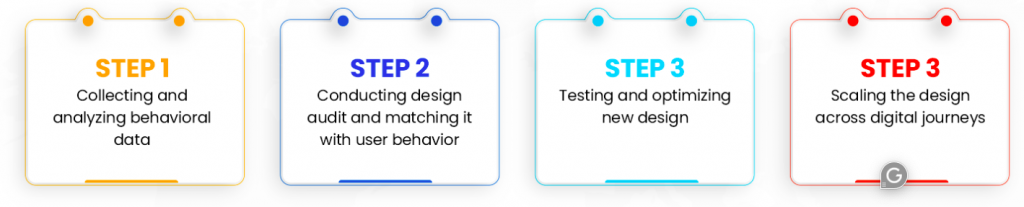
Test Regularly
It is a continuous work that needs to be integrated into the regular workflow. If you keep testing regularly, your navigation remains up-to-date, highly intuitive, and appropriate for the ever-changing needs of users.
Technology moves on, and there might be new features like sticky menus that need to improve usability.
With constant testing and data-based refinement of your navigation, you will have a pretty customer-critical but performance-enhancing interface for your platform.
Partner with Appkodes
In essence, efficient e-commerce navigation plays a very vital role in making the online shopping experience fun and high seamlessness. It controls the users seamlessly and reduces the hassle of catching customers; thus can also be called an effective approach to enhance conversions.
This would include such usability-enhancing tools as faceted search, intuitive filter, personal recommendation, organized category structure, and many others.
Speak to an e-commerce app development company on how to improve the navigation on your site by incorporating advanced integrations and an ecommerce payment gateway to drive the business forward. Confused about choosing developers?
Don’t worry, employing the above-mentioned strategies with the help of Appkodes developers. As a leading E-commerce App Development Service, we understand the importance of user experience in today’s competitive online marketplace. So that you can increase user experience and satisfaction; thus, increasing sales for the business.
Our developers help bring these sophisticated navigation features into your e-commerce platform so that your user has a cool and engaging experience. Also, help update these features to keep customers engaged.
Appkodes are set to provide optimized e-commerce navigation systems with a high conversion rate; therefore, they will effectively suit as partners in building easy-to-use data-driven solutions. Start improving your e-commerce navigation now!

Thangamanikandan Bharathan
Starting as an iOS developer and moving up to lead a mobile team at a startup, I've expanded my expertise into Project Management, DevOps and eventually becoming a COO & Chief Service Officer in the IT sector. As a CSO, I excel in team leadership, technical advice, and managing complex business functions, focusing on combining technology and operations to drive growth. I'm keen to connect for collaborations or to exchange insights in the tech world!


